
Spring table settings succeed or fail based on restraint. The season itself provides abundance — tulips, daffodils, cherry blossoms, new leaves — and the temptation is to bring all of it to the table at once. The result is usually clutter. A spring table should feel fresh and light, not crowded. This means choosing a clear color story, limiting the number of floral varieties, and leaving enough negative space on the table for the setting to breathe. Color is essential, but it must be applied with discipline.
This article examines five distinct approaches to spring table settings, explains the color palettes and materials that make each work, and provides practical guidance on centerpiece construction, place setting composition, and the small details that separate a considered table from a merely decorated one. The goal is tables that feel celebratory without looking labored.


Why Spring Table Settings Require Different Thinking
Winter tables can rely on candlelight, rich fabrics, and deep colors to create atmosphere. Summer tables benefit from outdoor light and the relaxed expectations of casual dining. Spring sits between these extremes. The days are brighter but not yet long. The weather is improving but still unpredictable. Meals might happen indoors or out, formally or casually, and the table setting needs to work in either context.
Spring color is also specific. The palette is lighter and clearer than autumn's muted tones but softer and more varied than summer's saturated brights. Successful spring tables use colors that feel optimistic without being childish — coral rather than hot pink, butter yellow rather than neon, soft green rather than lime. These colors work because they reference early growth and new blooms without exaggerating them.
The materials matter as much as the colors. Heavy linens and dark wood chargers feel wrong in spring. The season calls for lighter weights — cotton napkins rather than damask, ceramic rather than silver, clear glass rather than cut crystal. The table should feel like it could be carried outside if the weather turns favorable. Portability and ease are part of the seasonal character.


Five Spring Table Approaches: Palettes, Occasions, and Elements
The table below outlines five approaches to spring table settings, each with a distinct color palette and appropriate context. Understanding these differences before planning a table prevents the common mistake of combining elements from multiple styles, which creates visual confusion rather than cohesion.
Style Approach | Color Palette | Best Occasion | Key Elements |
Garden Abundance | Coral, butter yellow, soft green | Brunch, casual lunch | Low vases, scattered blooms, linen |
Pastel Elegance | Blush, lavender, mint, ivory | Formal dinner, celebration | Tall arrangements, china, crystal |
Citrus Bright | Lemon, tangerine, lime green | Outdoor lunch, afternoon tea | Bold patterns, ceramic, fruit accents |
Meadow Natural | Wildflower mix, cream, sage | Rustic gathering, family meal | Loose stems, wood, minimal fuss |
Modern Minimal | White, pale yellow, grey-green | Contemporary dinner, small group | Single-stem vases, clean lines, restraint |

Strategy and Execution by Table Style
Garden Abundance: The Gathered Table
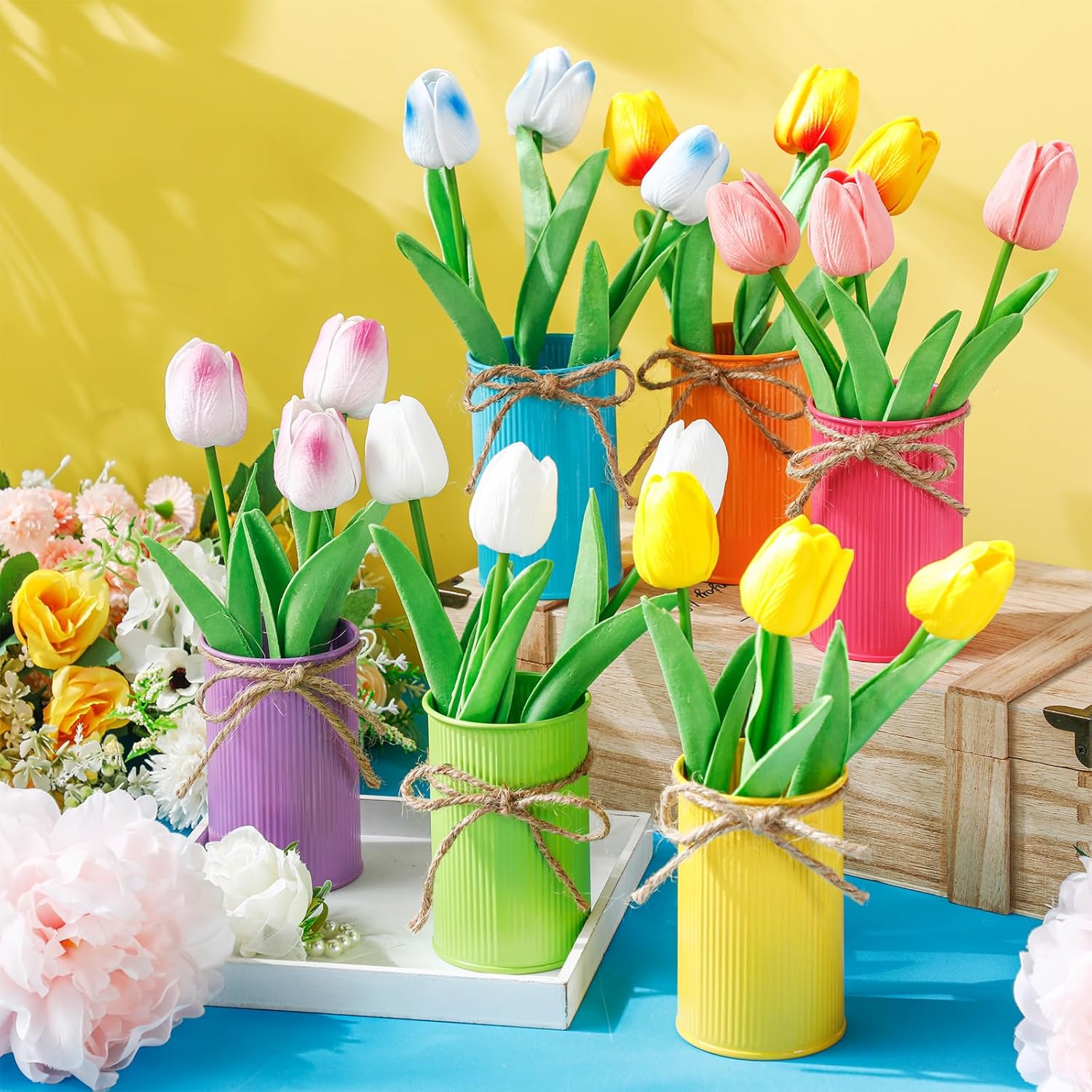
The garden abundance approach uses flowers as if they were just picked — stems of varying heights, blooms at different stages, foliage still attached. The centerpiece is not a single formal arrangement but multiple small clusters positioned down the length of the table. Low vessels work best — ceramic bowls, glass tumblers, or even repurposed jam jars if the aesthetic is informal enough. The flowers should look like they came from a cutting garden rather than a florist.
The color palette is warm and saturated: coral ranunculus, butter-yellow tulips, soft peach roses, with eucalyptus or olive branches for greenery. Avoid mixing in purple or blue, which will cool the palette and muddy the effect. The table linens should be natural linen in cream or pale grey, allowing the flowers to provide all the color. Napkins can be tied with twine or left loose — formality is not the goal here.
Place settings for a garden abundance table should be simple. White or cream ceramic plates, plain flatware, and clear glassware all work. The interest comes from the flowers, not from patterned china or decorative chargers. If you want additional color, introduce it through napkins in a single accent tone that picks up one of the flower colors. The overall effect should be abundant but not fussy, colorful but not chaotic.


Pastel Elegance: The Formal Celebration
Pastel elegance is the approach for formal spring occasions — Easter lunch, a bridal shower, a milestone birthday. The palette is soft and harmonious: blush pink, lavender, mint green, and ivory. The flowers are refined rather than wild — peonies, sweet peas, garden roses — arranged in tall vases or low compotes with careful attention to symmetry and form. This is not a casual table. It is designed to be noticed and photographed.
The table linens should be pristine and pressed. White or ivory linen tablecloths with matching napkins create the necessary formality. Place settings use fine china, polished silver, and crystal stemware. The centerpiece should be substantial but not so tall that it blocks conversation — the top of the arrangement should sit below eye level when guests are seated. Candles in complementary colors add height and create the layered lighting that makes a formal table feel complete.
The risk with pastel elegance is crossing into saccharine territory. Avoid this by limiting patterns and decoration. If the china has a floral pattern, keep the napkins and tablecloth plain. If you use patterned napkins, choose solid-colored plates. The restraint in one area allows richness in another without the table becoming visually overwhelming. The goal is elegance, not excess.


Citrus Bright: The Energetic Outdoor Table
Citrus bright is for tables that celebrate color without apology. The palette is bold, featuring lemon yellow, tangerine orange, and lime green, with touches of white to provide visual relief. This approach works best for outdoor dining or tables positioned near large windows where natural light will amplify the colors. In dim light, citrus brights can look garish. In sunlight, they look joyful and energized.
The centerpiece can incorporate actual citrus fruit — lemons and limes clustered in a bowl, orange slices floating in a low glass vessel, or kumquats scattered among flowers. The flowers themselves should be chosen for their intensity: consider marigolds, zinnias, and gerbera daisies in matching citrus tones. Avoid pastels entirely — they will look washed out next to the saturated colors and weaken the overall effect.
Table linens and ceramics for a citrus bright table should either match the palette or provide a strong contrast. White plates and napkins with citrus-colored glassware work well. Patterned plates in coordinating colors can also succeed if the pattern is bold and graphic rather than delicate. This is not a table for heirloom china or subtle details. It is designed to make an impression and should commit fully to that goal.

Meadow Natural: The Effortless Rustic Table
Meadow natural is the least formal spring table approach and often the most appealing for people who want beauty without stress. The centerpiece consists of wildflowers or market flowers arranged loosely in simple vessels — mason jars, enamelware pitchers, or ceramic crocks. The stems are visible, the arrangement is asymmetrical, and the overall effect is as if someone gathered flowers on a walk and placed them on the table without fussing.
The color palette is mixed and unforced, featuring a combination of flowers in cream, yellow, purple, pink, and blue, along with an abundance of greenery. The lack of strict color control is part of the appeal. The table should feel abundant and natural rather than designed. Wooden serving boards, linen napkins with frayed edges, and simple stoneware plates all support this aesthetic.
The meadow natural table works for family meals, casual entertaining, and any occasion where formality would feel out of place. It requires good flowers and good food but very little else. The centerpiece can be assembled in ten minutes. The place settings need no special coordination. The table succeeds because it looks uncontrived, and the best way to achieve that is to not contrive it.


Modern Minimal: The Restrained Contemporary Table
Modern minimal spring tables use color sparingly and rely on form, negative space, and careful editing to create impact. The palette is restricted: white flowers, pale yellow tulips or daffodils, and grey-green foliage. No more than two or three colors appear on the entire table. The centerpiece is often a single type of flower in a single vessel — a dozen white tulips in a cylindrical glass vase, or three stems of pale yellow peonies in a low ceramic bowl.
The table linens are neutral: white, pale grey, or natural linen. The plates are simple and contemporary — white porcelain or matte ceramic in a single color. The flatware is minimal in design, and the glassware is clear and unornamented. The restraint in each element is what allows the few colors present to register clearly. One pale yellow napkin on an otherwise white table becomes a deliberate accent rather than a random detail.
This approach requires confidence and discipline. It is easy to feel that a minimal table looks unfinished and to start adding elements — more flowers, patterned napkins, decorative chargers — that undermine the simplicity. Resist that impulse. The power of a modern minimal spring table comes from what is not there. If the core elements are well chosen and well placed, nothing else is needed.


Centerpiece Construction and Common Mistakes
The most common centerpiece mistake is using vessels that are too tall. A centerpiece should not obstruct sightlines across the table. If guests have to lean around the arrangement to see each other, the centerpiece has failed, regardless of how beautiful it is. Keep arrangements below 35 centimeters in height, or use very tall, slender vases that rise well above eye level, creating a canopy effect that preserves sightlines underneath.
Another frequent error is insufficient water and poor stem preparation. Flowers on a dining table will sit for several hours, often in a warm room. If the stems are not freshly cut and the vessels not properly filled, the flowers will wilt visibly during the meal. Cut stems at an angle, remove any foliage that will sit below the water line, and use flower food if available. Check water levels before guests arrive.
Finally, consider the table proportions. A long rectangular table can support multiple centerpiece elements — three or five arrangements positioned at intervals down the center. A round table needs a single central arrangement or a ring of smaller vessels around a focal candle or object. The centerpiece should feel integrated with the table shape rather than imposed upon it.

The Purpose of the Spring Table
A spring table is not a decoration for its own sake. It is the setting for a meal and the framework for conversation. The flowers, the linens, the china — all of it exists to make the people at the table feel welcomed and valued. This means the table should be beautiful but not precious, impressive but not intimidating, memorable but not so elaborate that guests feel uncomfortable participating in the meal.
The best spring tables are the ones where someone later remembers the conversation or the food rather than the napkin rings. The setting should enhance the occasion without overshadowing it. Choose an approach that fits the meal, the guests, and your actual capacity for preparation. A simple table executed well will always outperform an ambitious table executed poorly. Start with clarity of intent, edit ruthlessly, and let the season itself do most of the work.


.jpg "A collection of Colorful And Inspiring Spring Centerpieces and Table Settings Ideas")


